iSlide - Brand Identity | Logo Design Case Study

Project Overview
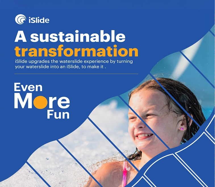
We gave iSlide a brand identity built for two audiences at once: park operators who need to see ROI, and riders who just want more fun. The result is a system that reads playful on the slide and credible in the boardroom.
The Challenge
iSlide's product is genuinely exciting, an existing waterslide reimagined with light, sound and projection. But the old identity didn't carry that energy. It felt more like a technical vendor than a brand guests would remember or operators would want to champion.
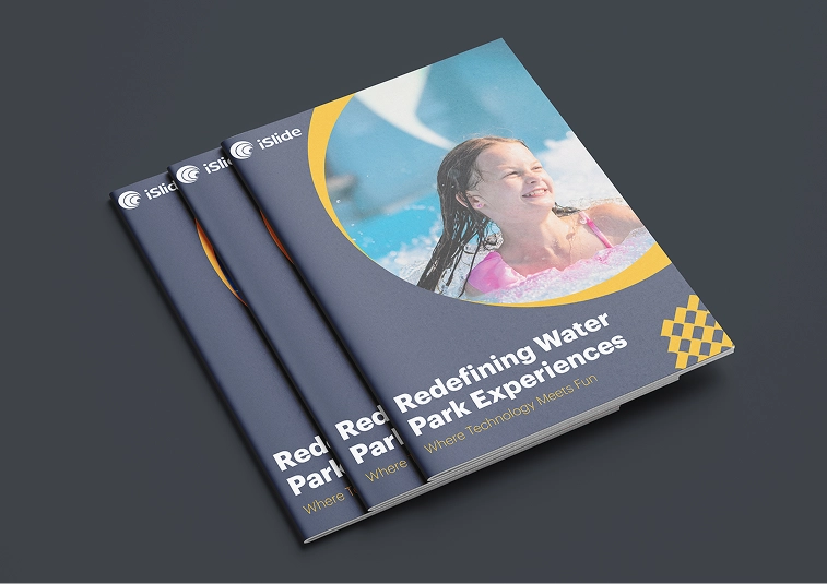
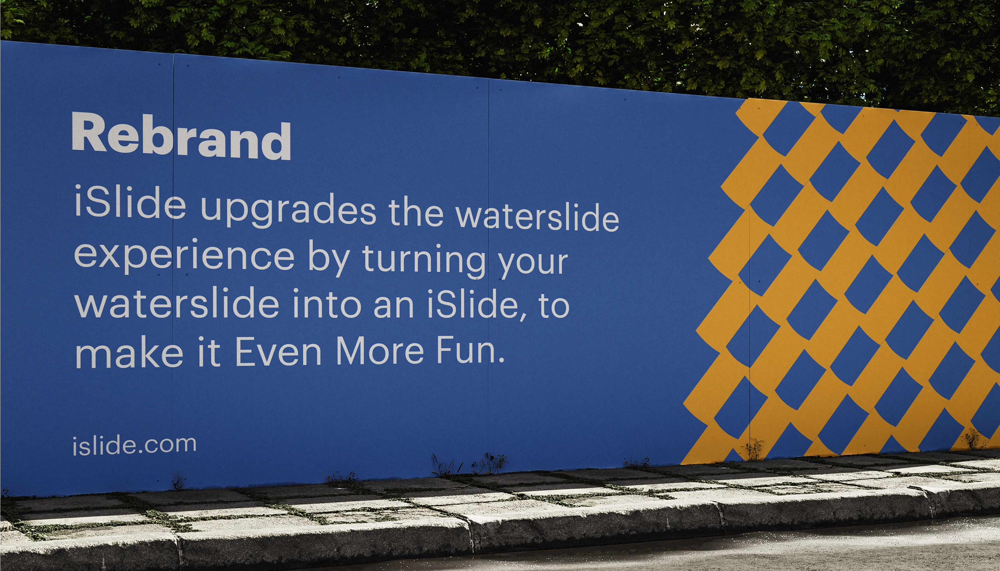
THE RESULT
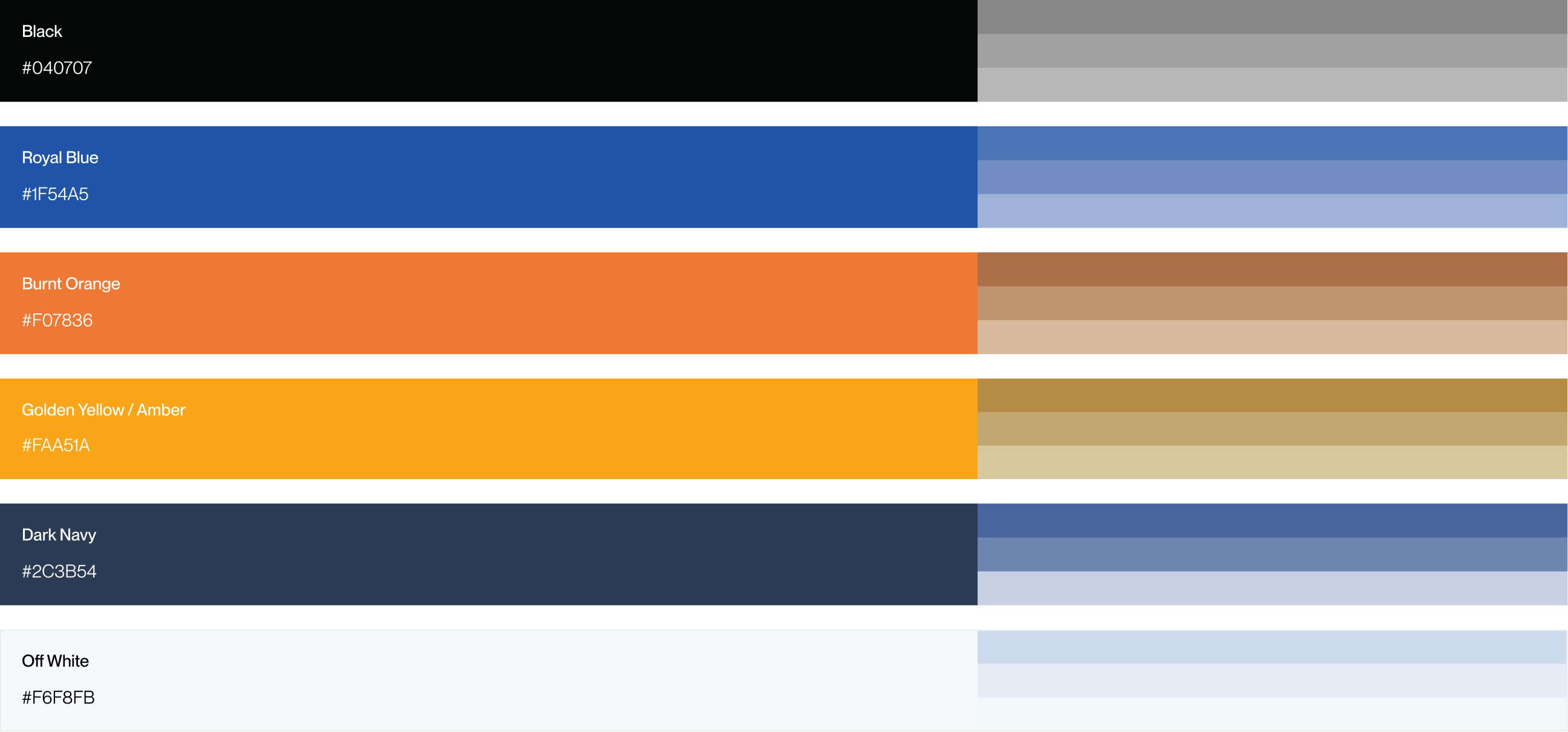
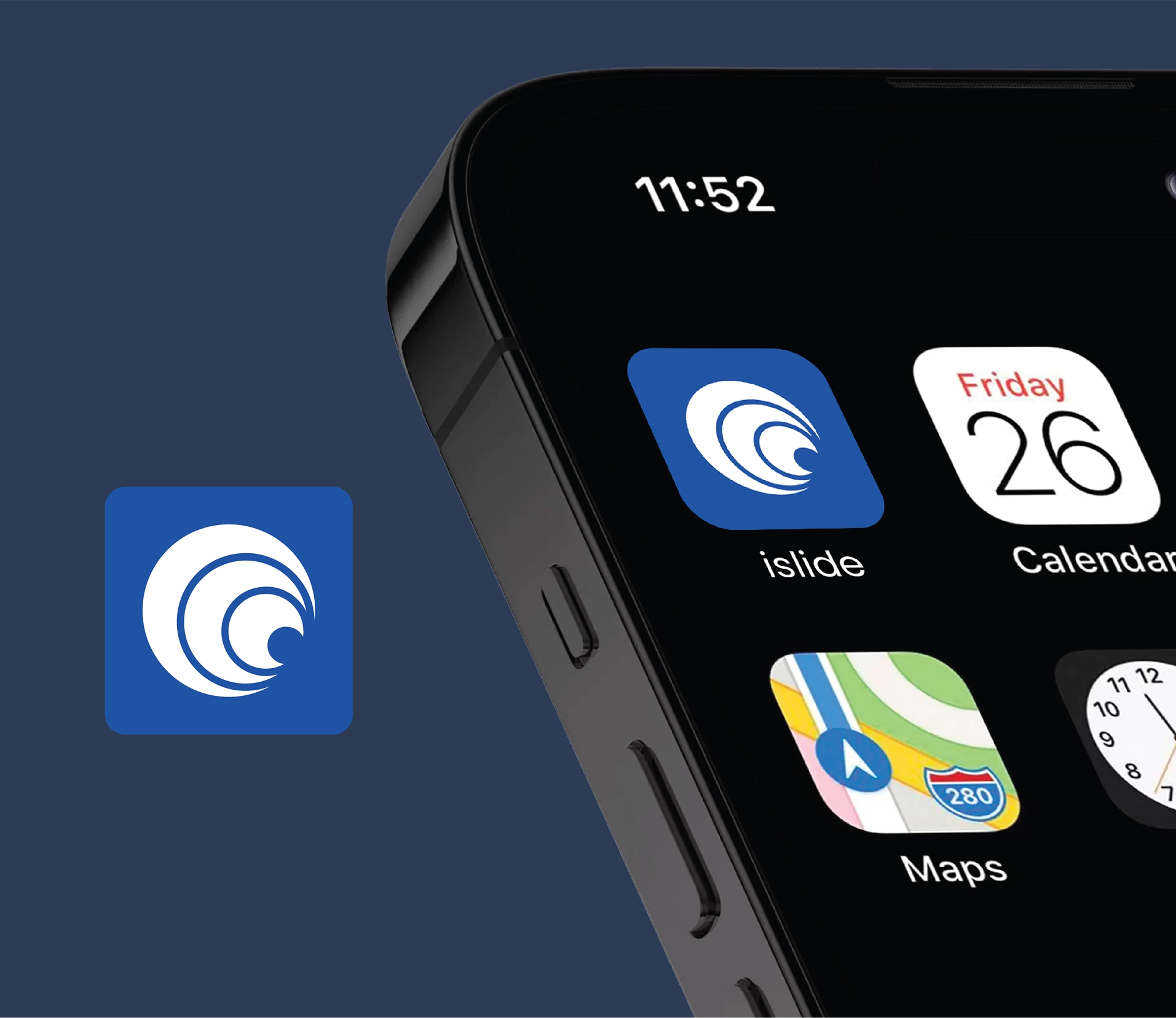
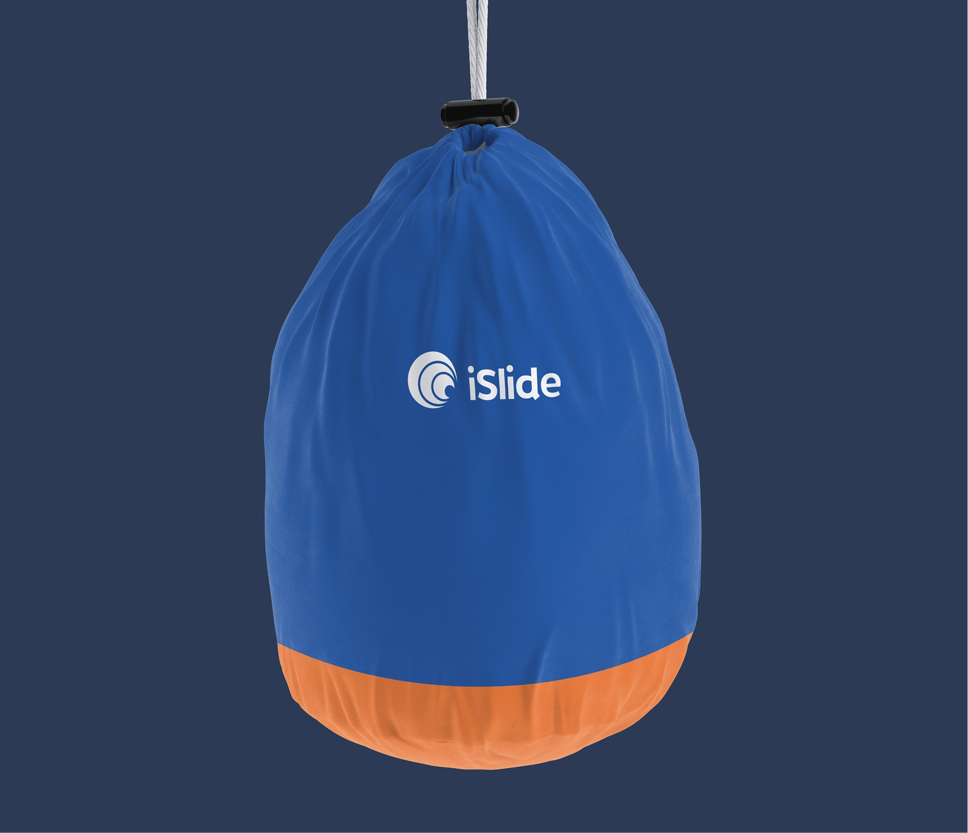
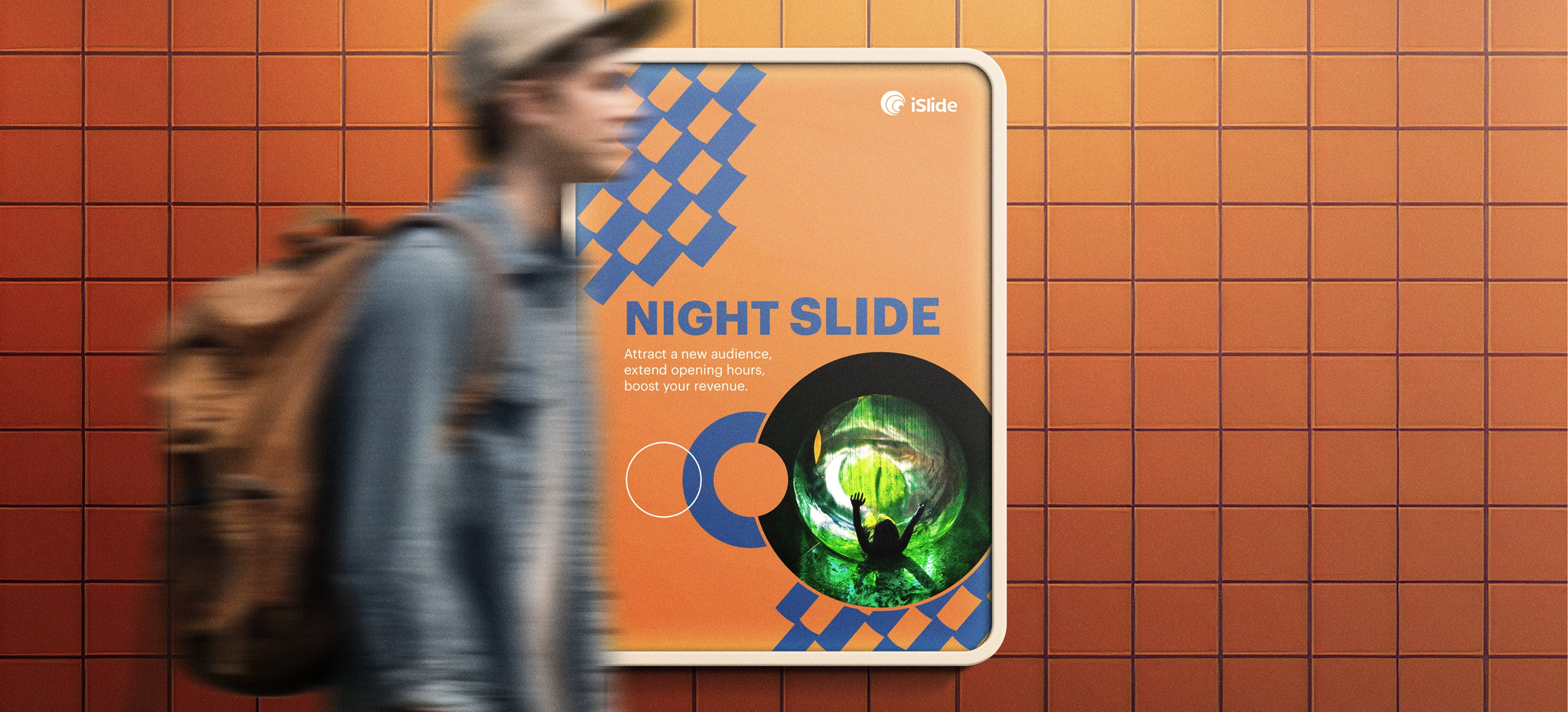
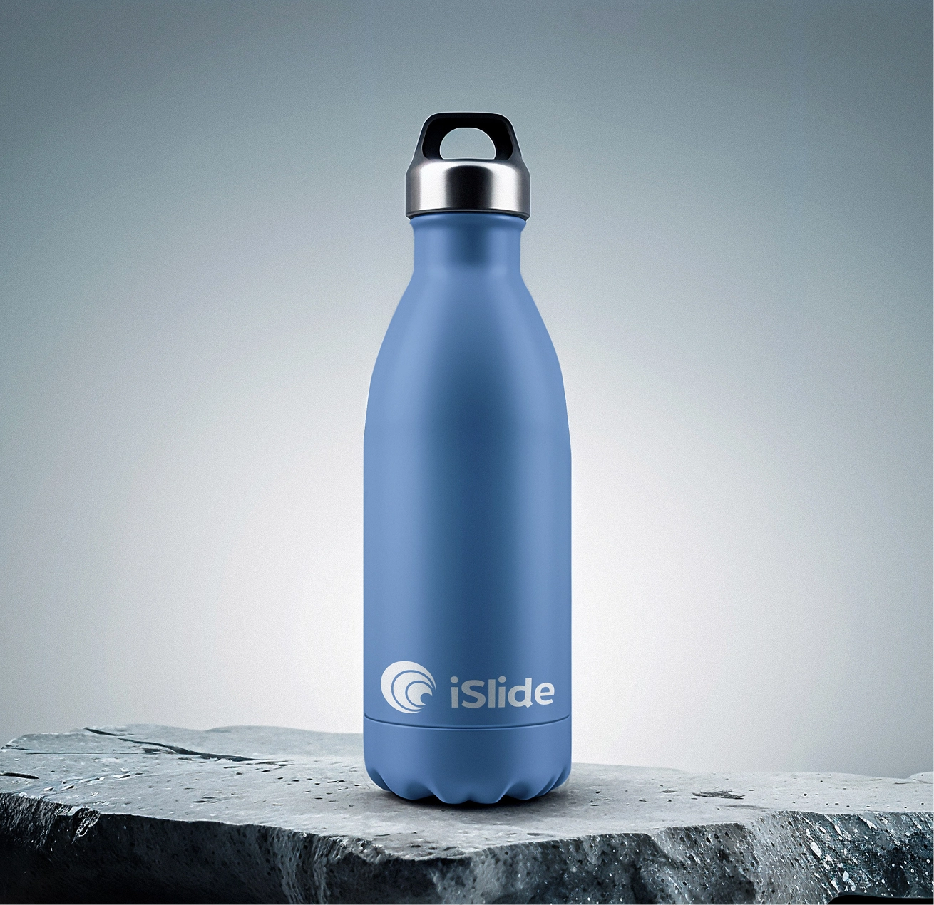
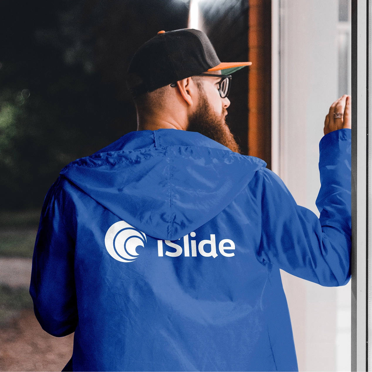
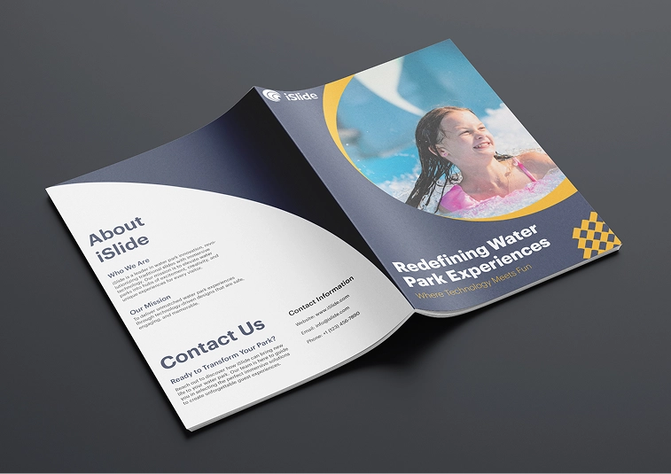
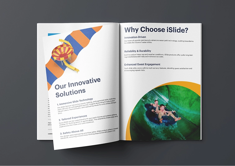
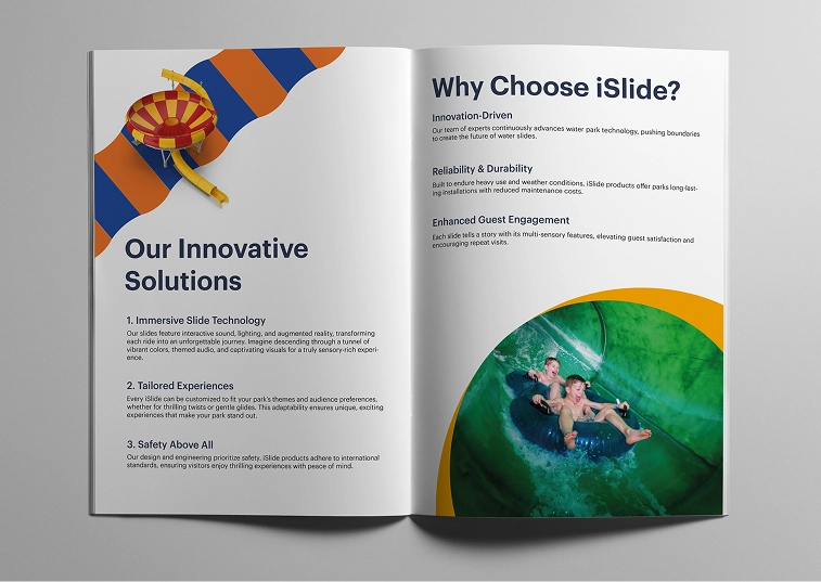
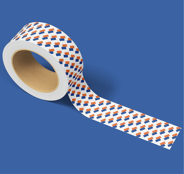
A bold, motion-led identity anchored by a swirl mark that nods to water and speed, paired with a confident blue, orange and amber palette. Applied consistently across the app, apparel, bottles and the slides themselves, it turns a functional upgrade into a brand experience people actually talk about.
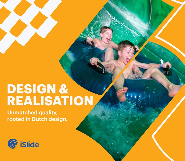
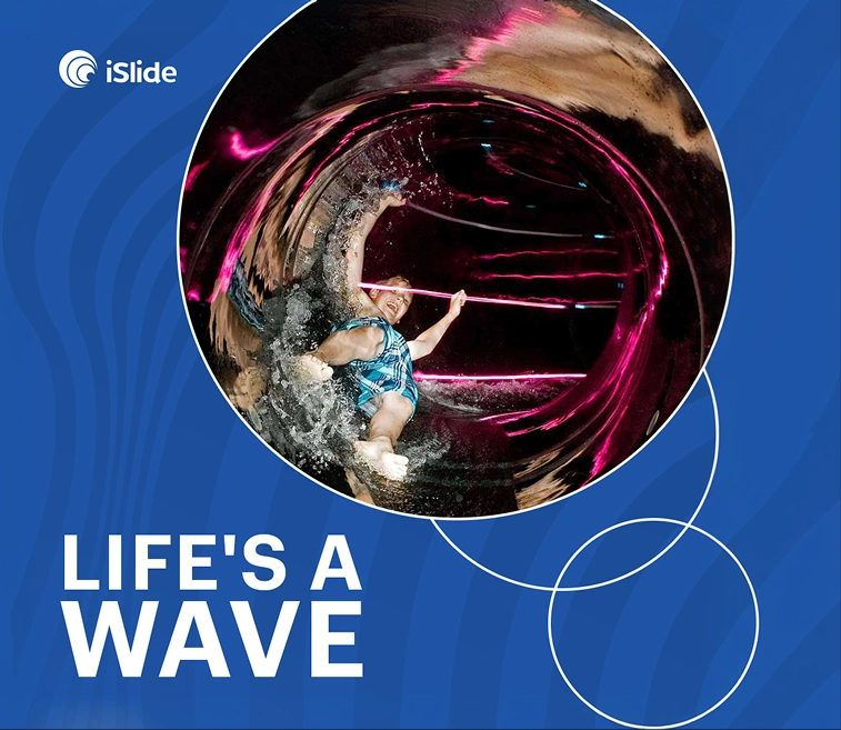
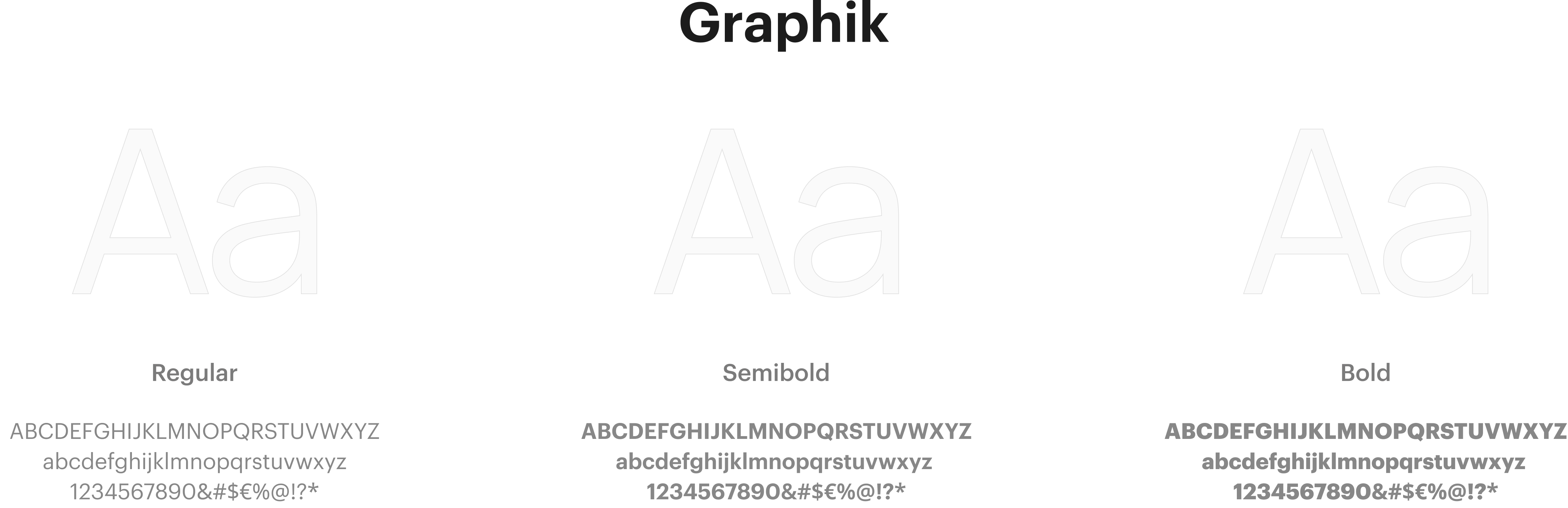
TYPOGRAPHY & COLOR SYSTEM